#1 Traffic 
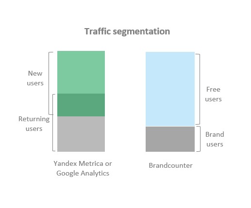
Traffic segmented by user type:
- Free users — visit the resource 1 day
(free from the brand) - Brand users — visit the resource >1 day
(loyal to the brand)
Reach — number of users:
- DAU — Daily Active Users
- WAU — Weekly Active Users
- MAU — Monthly Active Users
The traffic in the report is grouped by 3 time periods: by days, by 7 days, by 30 days. Button selection: Day Wk Mo respectively
PageViews — number of page views for 1, 7, 30 days
Frequency — avg number of user page views for 1, 7, 30 days
Freq = PageViews/Reach
Minutes — the number of minutes spent by users on the site for 1, 7, 30 days
Time — avg user time on the site for 1, 7, 30 days
Time = Minutes/Reach
Min и Time are shown ![]()
The average share of the brand in daily traffic for the period of time set by the brush-chart «sliders» for the selected date is shown by turning on the 100% checkbox
Brand share: β = Brand users/All users
The average value of β for the selected time period can be found in the graph title

General notes:
The key difference between Brancounter and traditional web analytics systems is the way users are segmented (see fig.)
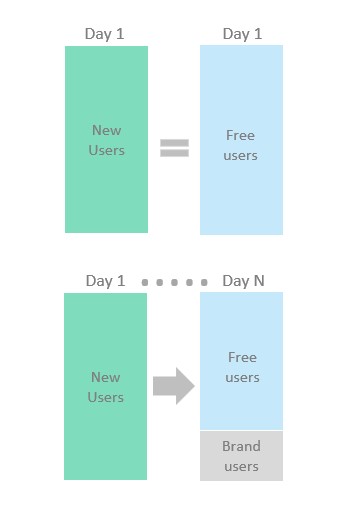
New users - in the reporting period of 1, 7 or 30 days, the resource was visited for the first time 1 or more times
Free users - in the reporting period of 1, 7 or 30 days, visited the resource for the first time 1 or more times and only on 1 of the days
Returning users - during their lifetime on the reporting date, they visited the resource 2 or more times
Brand users - during their lifetime on the reporting date, they visited the resource 2 or more times in at least 2 days
Example: 2 users visited the resource for the first time 10 times each during the reporting period of 7 days:
1st: only on 5th day — New, Returning and Free
2nd: on 1st and 7th days — New, Returning and Brand
In the example, both users are both New (visited for the first time) and Returning (visited >2 times).
In the Brandcounter segmentation: 1st user is Free (1 day of visit) and 2nd user is Brand (2 days of visit)
In the general case, the inequality:
Brand users ≤ Returning users
There is no special New Users report in Brandcounter. The fact is that in the particular case of choosing the traffic aggregation period = 1 day:
New User = Free Users
Equality follows from the definition of Free Users (see above). Conversion to the New Users brand within a day is impossible by definition. Thus, on a day, the Free Users traffic reports are identical to New Users and there is no point in duplicating the reports. Why was priority chosen in the Free Users traffic name?
During the data aggregation period >1 day, part of the New User can be converted into a brand (revisit the resource)
Example. A new resource has been launched. What will be the total traffic for N days if:
— All New Users after the 1st day visit the resource every day (100% conversion)
-New Users come per day =100
Brandcounter:
— Traffic for N days = 100 New Users (last day) + 100 (N-1) Brand users
Yandex Metrica or Google Analytics counters will show:
— Traffic for N days = N*100 New Users, since in the period [from 0 to N days] users made their 1st visit to the resource. By definition, all users will be New Users
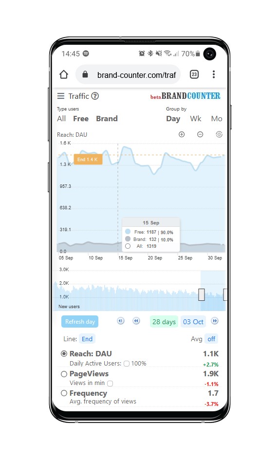
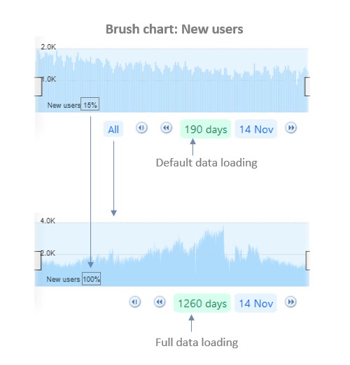
Under the main chart of all reports without exception, there is a Brush chart with New Users traffic. In addition to the function of a regular chart, the Brush chart allows you to select the period of data display on the main chart. In addition, using the joystick under the chart, you can discretely (30 days) or completely download all available data in the database for viewing.
See fig. To the right of the signature "New users=15%" the share of downloaded data is indicated
New Users are the main source of traffic generation
#2 Conversion
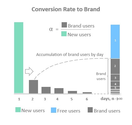
Conversion Rate to brand, α — is the proportion of New Users who returned after the day of the 1st session
α = Brand users/New users
- New users — visited resource for the first time
- Brand users — returned after day 1 of the session
The figure shows the accumulation process by day of New Brand — from the New Users of 1-day.
Conversion time, Tc — avg number of days users return from the day of the 1st session
Time (period) of conversion Tc — different from visit period T2 — Brand Users (see #3). Usually T2 >Tc since interest in the brand decreases over time and, accordingly, ↑ T2
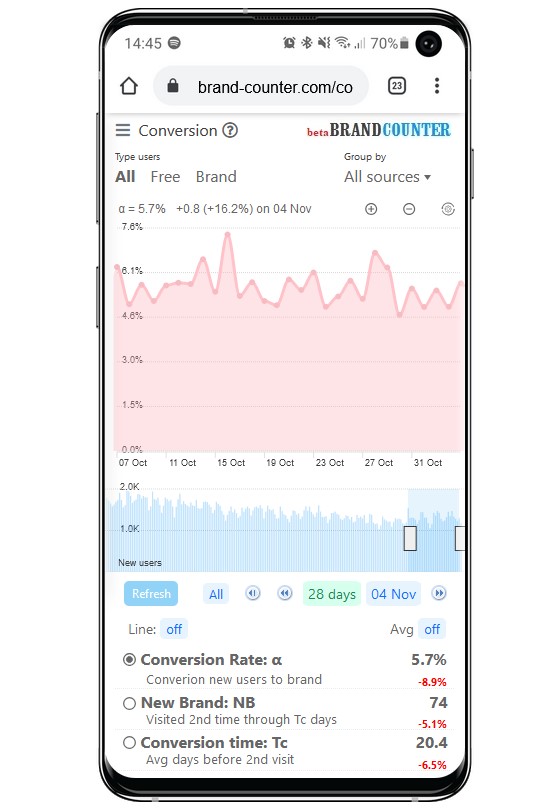
Report #2 on Nov 4 (see photo):
- Conversion to brand α=5,7% — this is the share of New brand who visited the resource 2nd time (2nd day visit)
- Visited the resource for the 2nd time after Tc days after the 1st day of the visit: New Brand, NB=74
- Avg conversion period Tc =20.4 days.
Normal conversion accumulation:
1day-25%; 7days-50%; 28days-60%; 90days-95% etc. Thus, only 74*50%=37 users made their first visit within the last 7 days in the New users status.
Including the Avg button — the result of averaging for the period set by the brush-chart «sliders» for the selected date is shown.
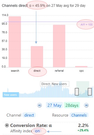
Source effectiveness New users
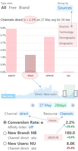
By default, the conversion is estimated by the segment: «All sources» (top right menu). The report provides a multi-layer filter for selecting a traffic source. The combination of buttons (see photo) allows you to view the conversion efficiency of various traffic sources. Including your advertising campaigns.
In segments, the conversion rate (α) of traffic sources is estimated according to a simplified procedure (approximately), and the longer the time interval is selected, the more accurate the result will be.
To assess the validity of α, the table shows the measurement data NB and NU
The brush-chart (below the main graph) shows the New users of the selected traffic source, which is valuable in itself for analyzing the overall traffic.
In addition to manually selecting data in the table "buttons above the table", you can manage data by clicking on the graph column
It is customary to evaluate the quality of an i-traffic source by comparing its αi with the totalαall :
Affinity index, Aff — shows how many times αi — source ↑ or ↓ than αall
Affinity index: Affi = αi /αall
The Affinity Index is shown only on the chart incl. «on» buttons. For ease of comparison, the graph shows the line Aff=100% (αi = αall)
Example (see photo): for the source «Direct» Aff = 46%. The efficiency of the «Direct» source is 100%-46%=54% less than the average for all sources.
For «Search» Aff=112%, search traffic efficiency is 112%-100%=12% more than average across all sources
General notes:
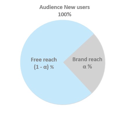
Since α is defined as the share of Brand users in the New users audience, another interpretation can be given:
α(%) is Brand reach. Accordingly, [1- α] is the Free reach of users
Brand reach, α - the number of users accumulated by the brand in % or abs. units, who will return to the resource 2 or more times
Abs. values Brand reach см в #3
New users remaining after the conversion will be called unbranded (Free):
New = Brand+Free
#3 Retention
Brand reach-frequency spectrum:
Brand reach(f+) — distribution of brand-retained users (reach) by the number of days (frequency) of resource visits.
- Retention quality indicator:
Brand reach, G(f+) — the number of users accumulated by the brand on the reporting date who will return to the resource f or more times during their lifetime (f+ = 2+, 3+…) - Conversion efficiency indicator:
Brand reach, α(f+), % — distribution of the share of users who converted to the brand by the number of days (f+) of visiting the resource during the lifetime.
α(f+) = G(f+)/G(1+), where G(1+) is the number of all users who visited the resource for the first time during the Lifetime period, T1 on the reporting date
In general, if we neglect the random measurement error on the daily sample of the conversion indicator α (see #2), then
Conversion rate,α ≈ Brand reach,α(2+)
The report shows dynamics slices by days for values f = 2+, 3+, 5+, 10+, 20+, 25+, 30+
Values α(f+)<0.1% are not shown
When the checkbox is disabled, the spectrum histogram is shown for the selected reporting date. When the Avg «On» button is enabled, the spectrum will be shown for the period of time selected by the Brush chart sliders for the reporting date

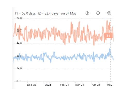
Lifetime, T1 — avg lifetime of Brand users who visited the resource on the reporting date
Period, T2 — avg period of visiting the Brand users resource on the reporting date
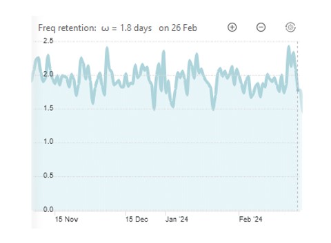
Note: The large spread of values in the photo is due to the small number of daily users. And the larger the data array on which measurements are made, the smoother the T1 and T2 curves will be (the same applies to ω, see below)
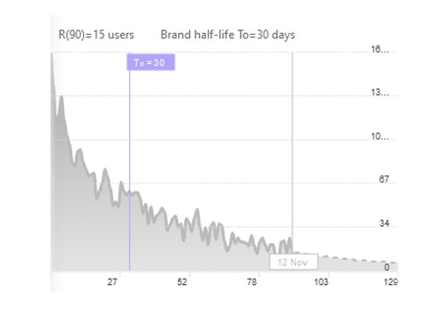
Brand retention, R(n) — the number of users accumulated by the brand on the reporting date who returned on the n-th day

The Brand retention curve shows the dynamics of brand aging over time

The T0 value (see the flag on the graph) is the half-life of the brand, it shows the time during which the brand loses 50% of the traffic accumulated on the reporting date. The T0 period can be interpreted as the period of renewal of permanent (brand) users of the resource by 50%
Freq retention, ω — the avg number of days a Brand user visits the resource during their lifetime
Freq retentin: ω = T1/T2
The total frequency is (ω+1), since the user was in the Free status on the 1st day.
For reference, the total average time of a brand user during his/her life on the resource is given:
Time retention: τ=(ω+1)*t
t — avg time on resource per day
The metrics provided in the report:
G(f+), T1 T2 — are fundamental independent parameters of brand retention that are responsible for the quality of the brand audience.
#5 User cost
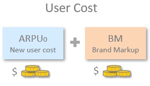
Lifetime Value: LTV — the average income of a user during his life on the resource
LTV= ARPU0(1+αω)____(1)
* formula for the case ARPU Free = ARPU Brand
- ARPU0 — avg revenue per New user
- αω — is the brand markup to ARPU0 due to the user’s additional revenue during his life on the resource
From (1) follows:
α=0 → LTV = ARPU0
α=1 → LTV = ARPU0(1+ω)
(1+ω) is the average number of visit days during the lifetime of a branded user on the resource. On the first day, the user was in the Free user status, so +1 is added to the brand retention frequency ω
Note that in (1) ARPU0 is for New users, not ARPU for the average user. In the general case, the following inequality holds
ARPU0 ≤ ARPU
ARPU— Average Revenue Per User
ARPU0 valume - user  settings ara used
αω - measured see #3
#6 Site cost
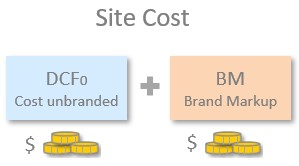
Discounted Cash Flow (DCF) — is a method for estimating the value of future cash flows.
DCF0=![]() P/(1+i0)ⁿ=P/i0=P n0
P/(1+i0)ⁿ=P/i0=P n0
see perpetual annuity formulas wikipedia.org
- Profit : P = Margin ۰ Revenue
- i0 — investment return period (yield)
- n0 =1/i0 — investment return period (payback)
For unbranded traffic i0=100% is preset (payback n0=1 year)
The formula for calculating the cost of the site:
DCF = DCF0(1+βω)___(2)
* formula for the case ARPU Free = ARPU Brand
- DCF0 — cost of unbranded Cash Flow
- βω — brand markup to DCF0 due to ↑ planning horizon of the brand’s Cash Flow
From (2) follows:
β=0 → DCF = DCF0
β=1 → DCF = DCF0(1+ω)
DCF0 valume  - user settings ara used
βω - measured see #1 и #3
![]() Calculator
Calculator
The financial results of your resource is the result of efficiency:
- Acquisitions new users (!)
- Retention new users (!)
For example, how to answer the question:
- What is better to increase New users by 20% or Conversion by 2 times?
The demo site calculator gives the numbers:
- New users+20%: DAU+20%, Revenue +20%, DCF +20%, LTV=0%
- Conversion +100%: DAU +7%, Revenue +17%, DCF +36%, LTV+22%
The choice depends on your priority:
↑ current revenue +20% (DCF+20%) or
↑ resource cost +36% (revenue+17%)
Independent parameters for influencing traffic:
- Lifetime: T1
- Visit Period
- Conversion, α — conversion to brand
- New users: NU
Traffic management
Extensive path
Buying New Users (!) A simple and risk-free way to increase traffic, subject to the following conditions:
Customer Acquisition Cost << LTV
Intensive way
↑Brand share, β — the share of branded users in the traffic structure. The growth of brand traffic is achieved through:
↑ T1: Lifetime
↓ T2: Visit Period
↑  α : Conversion

It is incredibly difficult to change the achieved values, since the parameters T1 and T2 have physical limitations.
It is impossible to significantly increase the frequency of purchases (visit period) and brand consumption time (lifetime) without a significant change in the concept: product, design, content, usability, etc. In other words, there is a huge risk of losing all achieved financial indicators in an effort to improve brand parameters: α и ω = T1/T2
However, it’s always good to know where your efforts will lead before making any changes.
In the calculator, varying the parameters ±T1 ; ±T2; ±α; ±NU, you get a change in your traffic indicators, see the Fact/Plan table and graph:
- DAU (reach in days)
- Revenue (per day, month, quarter, year)
- Cost user LTV (user cost)
- Cost site DCF (resource cost)
Useful notes for working with the calculator:
±New users  - leads to the same % change in traffic indicators, with the exception of LTV = const, since user behavior does not change depending on the number of users on the resource
±Conversion - the values of Freq retention (ω) and Time retention (τ) do not change. Since changing the New Brand number on the resource does not change the user's behavior
±Visit Period does not change Brand reach as visit frequency changes DAU but does not affect the number of users retained by a brand
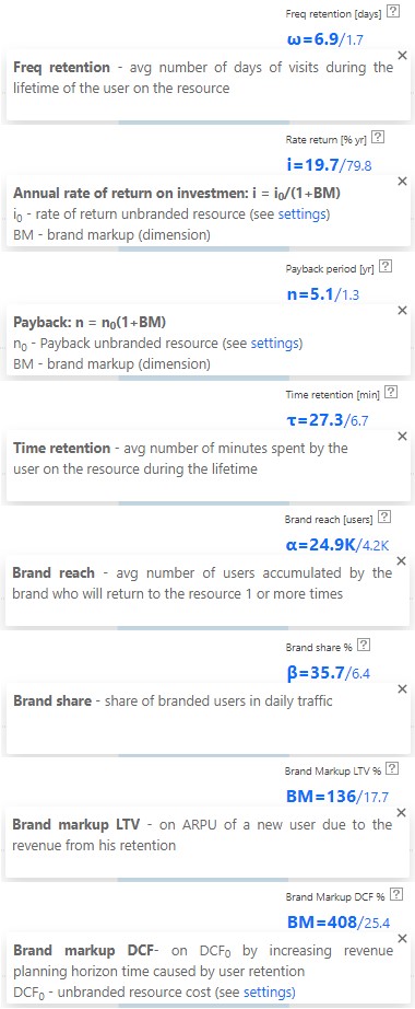
In addition to the main 4 traffic indicators given in the table, you can additionally display 1 out of 8 indicators in turn, see the upper right corner:
- Freq retention, ω
- Rate return, i
- Payback period, n
- Time retention, τ
- Brand reach, α
- Brand share, β
- Brand Markup LTV
- Brand Markup DCF
User interface
The reports use «Brush chart» charts. Moving the sliders to the left (right) in the lower diagram, select the scale along the X axis on the main graph
For the convenience of the user, the sliders can be moved with a fixed interval N (days) = 7, 28, 91 by clicking on the corresponding links:
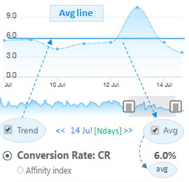
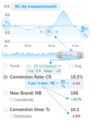
see fig: << [Ndays] Data >>
The table and graph are synchronized. When you select a reporting date (right slider), the table data is updated to the selected date.
Relative Change: RC= ∆V/V1 * 100
V1 — initial value
∆V=(V2−V1) — change per N days
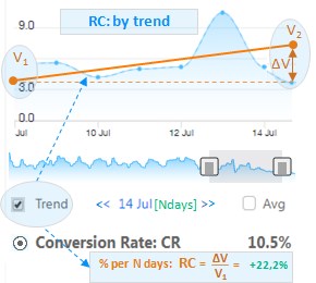
The trend smoothes out seasonal fluctuations, which allows for a more correct assessment of growth trends.
«Trend» checkbox — a linear trend is displayed on the chart using the least squares method. Accordingly, in the table replaces the RGR data from point to trend, see fig: −2,1% → +22,2%
«Avg» checkbox — replaces the point values in the table at the selected reporting date with the average values for the selected time interval ∆N days.
«Trend» checkbox — on (off) the «Avg line» on the chart
In Avg mode: RС = 0% therefore in the table the growth percentages are replaced with the text «avg» (see fig.)